LONG TERM
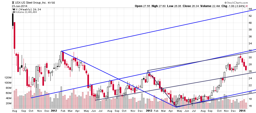
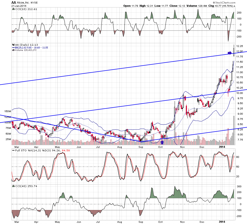
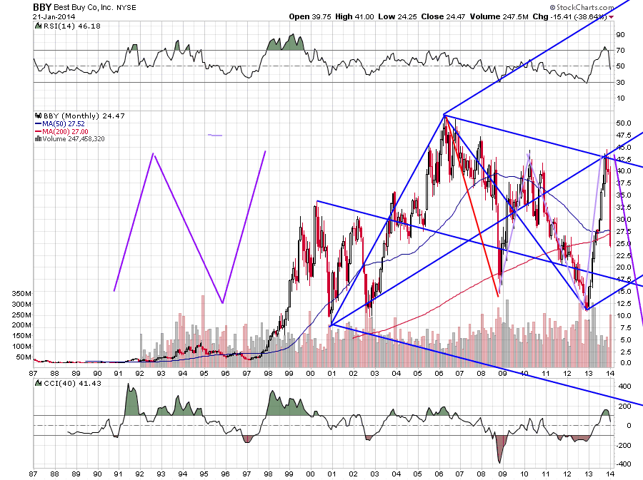
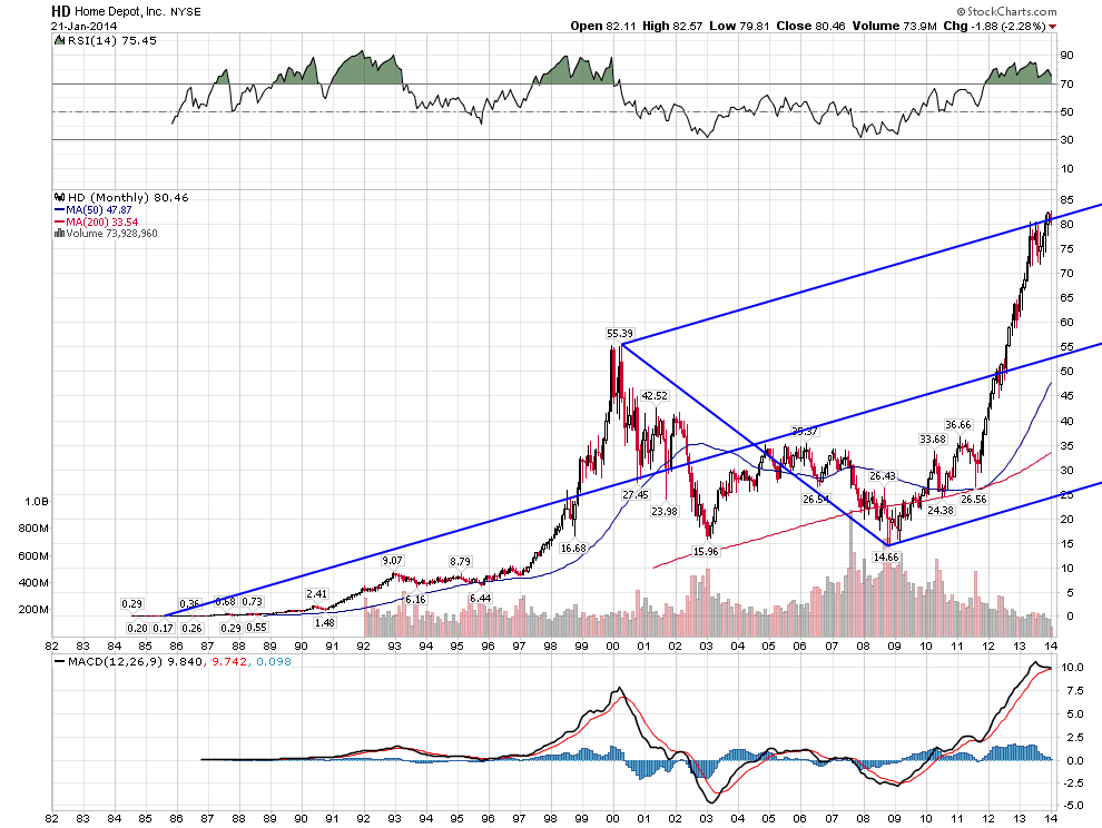
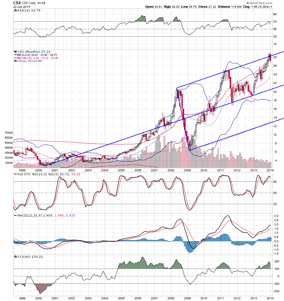
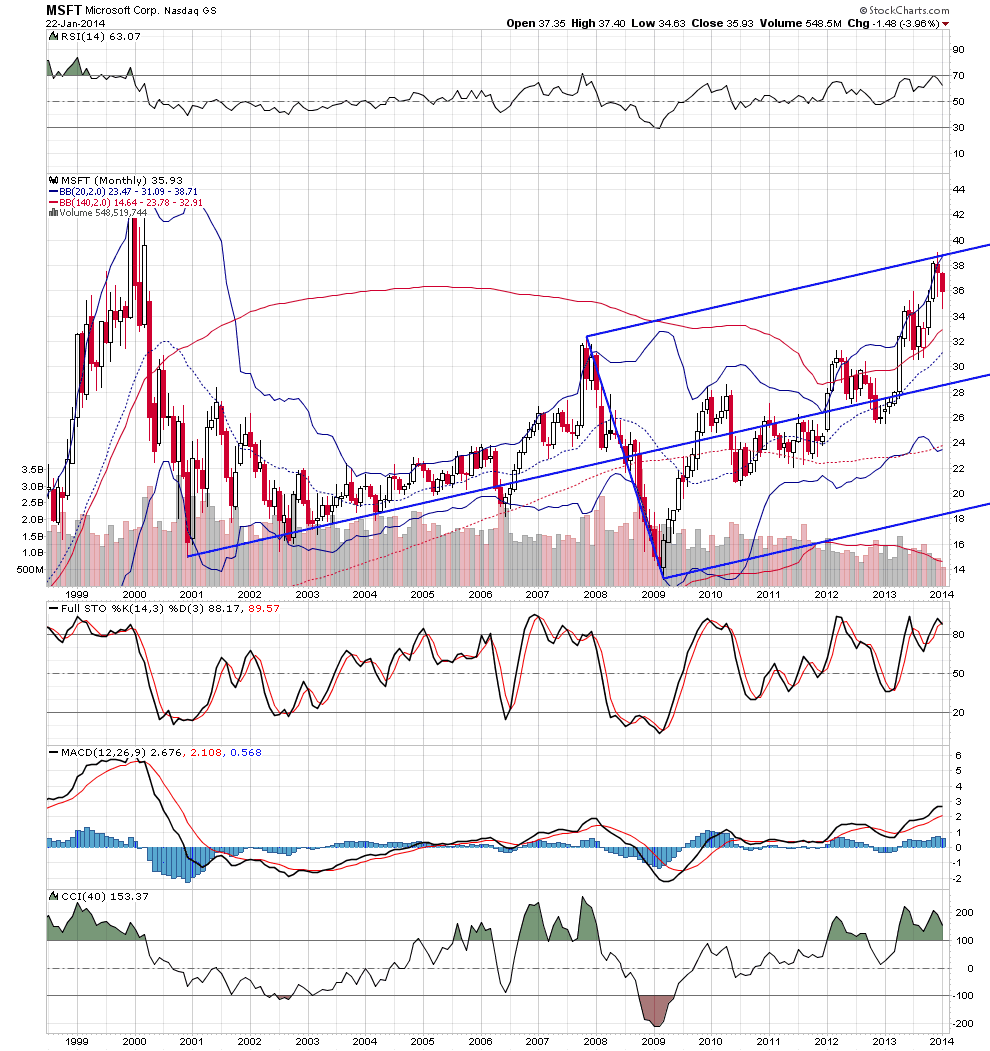
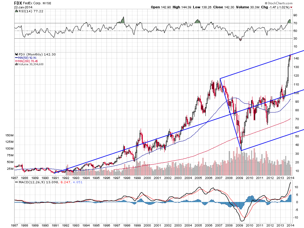
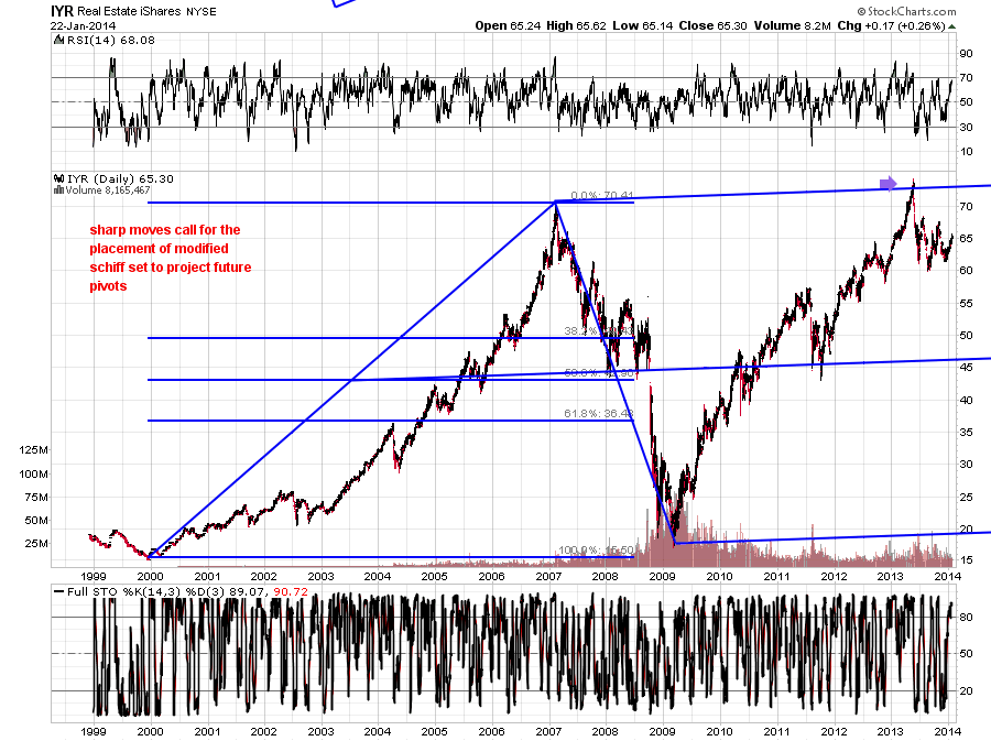
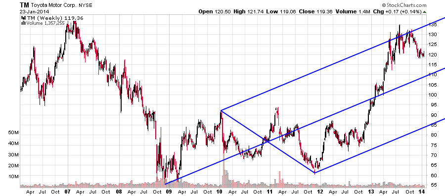
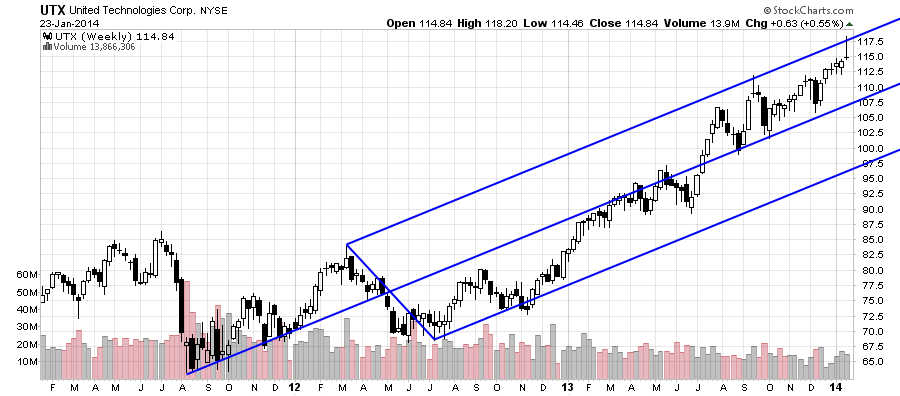
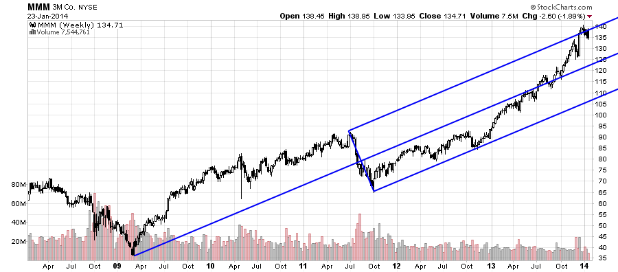
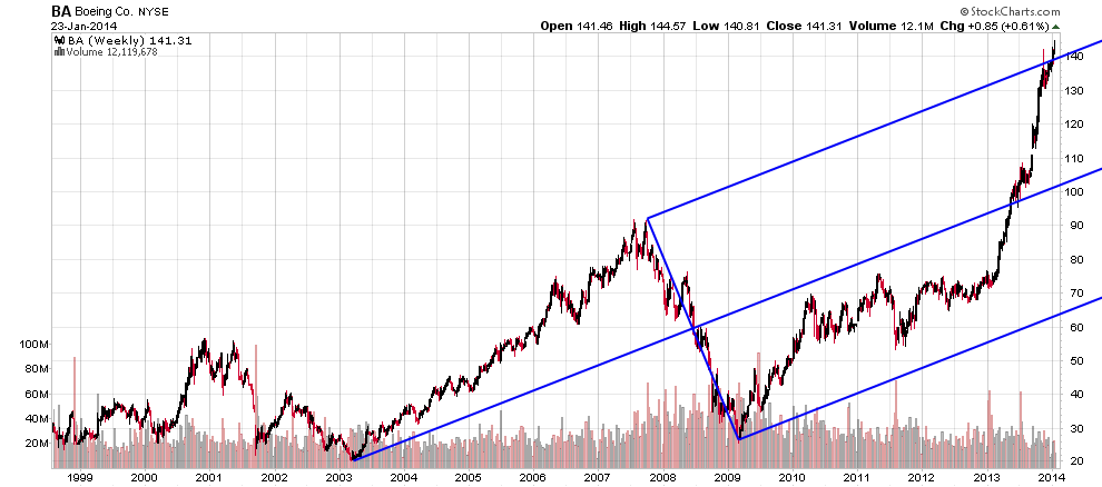
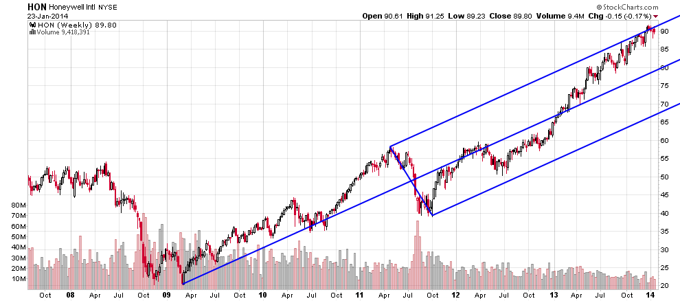
Andrews developed medianlines for weekly and monthly charts.
Honoring the original intent of his work, here is a set of long term charts.
The message is clear.
FOR THE FIRST TIME since the 2009 low across a broad spectrum of stocks,
price has reached the upside target given by the tools.
There may or not be one push higher left in the market ;but, the message based
on this set of tools is clear.
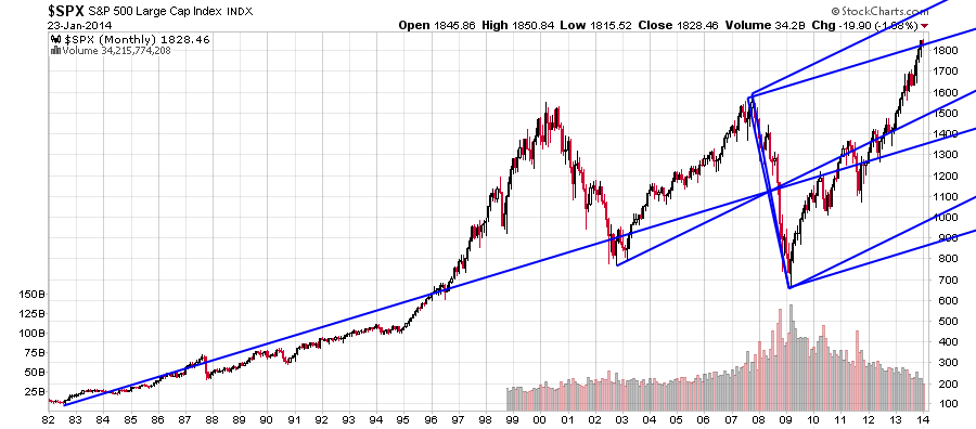
My uncertainty as to whether there might be one more new high is based on the two posiibilities
given by the long term charts of the$SPX .anchored on the 1982 low resistance was at recent high..
anchored on the 2003 low, there is resistance above.
For a remarkable summation of all the historical negatives at this juncture ,refernce the work at solarcycles.net.
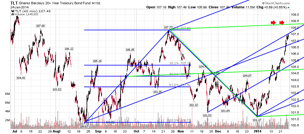
BONDS- working charts
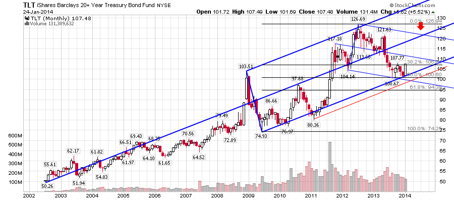
1st CHART shows how price, after reaching long term target, sold off to .50 of move off 09 low.Price was right but the time element
given by the lines was not. Price traded sideways until hit line.
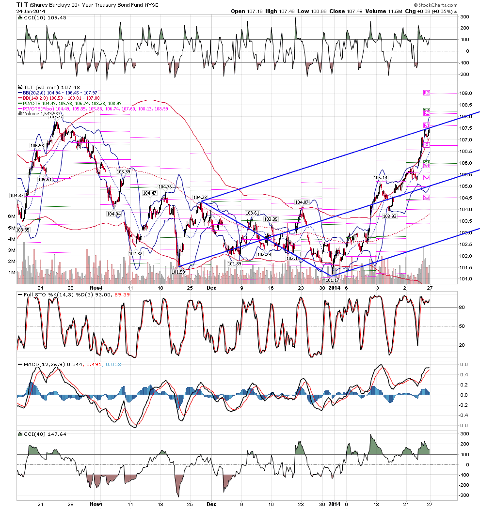
2nd CHART shows price has hit the smallest upside target given by tools.
3RD CHART shows what interests me most right now.The geometry at the double red arrows is the same as was present in GLD
that launched GLD to the recent marginal new low.... that level simply must be overcome or the alternative of one more marginal new low
in bonds allowed by the long turn chart remains a possibility.
Here are the charts.
Emini Day Trading /
Daily Notes /
Forecast /
Economic Events /
Search /
Terms and Conditions /
Disclaimer /
Books /
Online Books /
Site Map /
Contact /
Privacy Policy /
Links /
About /
Day Trading Forum /
Investment Calculators /
Pivot Point Calculator /
Market Profile Generator /
Fibonacci Calculator /
Mailing List /
Advertise Here /
Articles /
Financial Terms /
Brokers /
Software /
Holidays /
Stock Split Calendar /
Mortgage Calculator /
Donate
Copyright © 2004-2023, MyPivots. All rights reserved.
Copyright © 2004-2023, MyPivots. All rights reserved.
