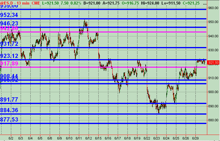
Monkey 13min S/R Chart
Just a map of Support and Resistance price levels derived from price action intraday over the past few weeks. The lines are merely "zones" as a map for working your own trading strategies around. Just offering this up as I always keep it updated and find it useful in my own trading. Open to any input/feedback and other charts and analysis!
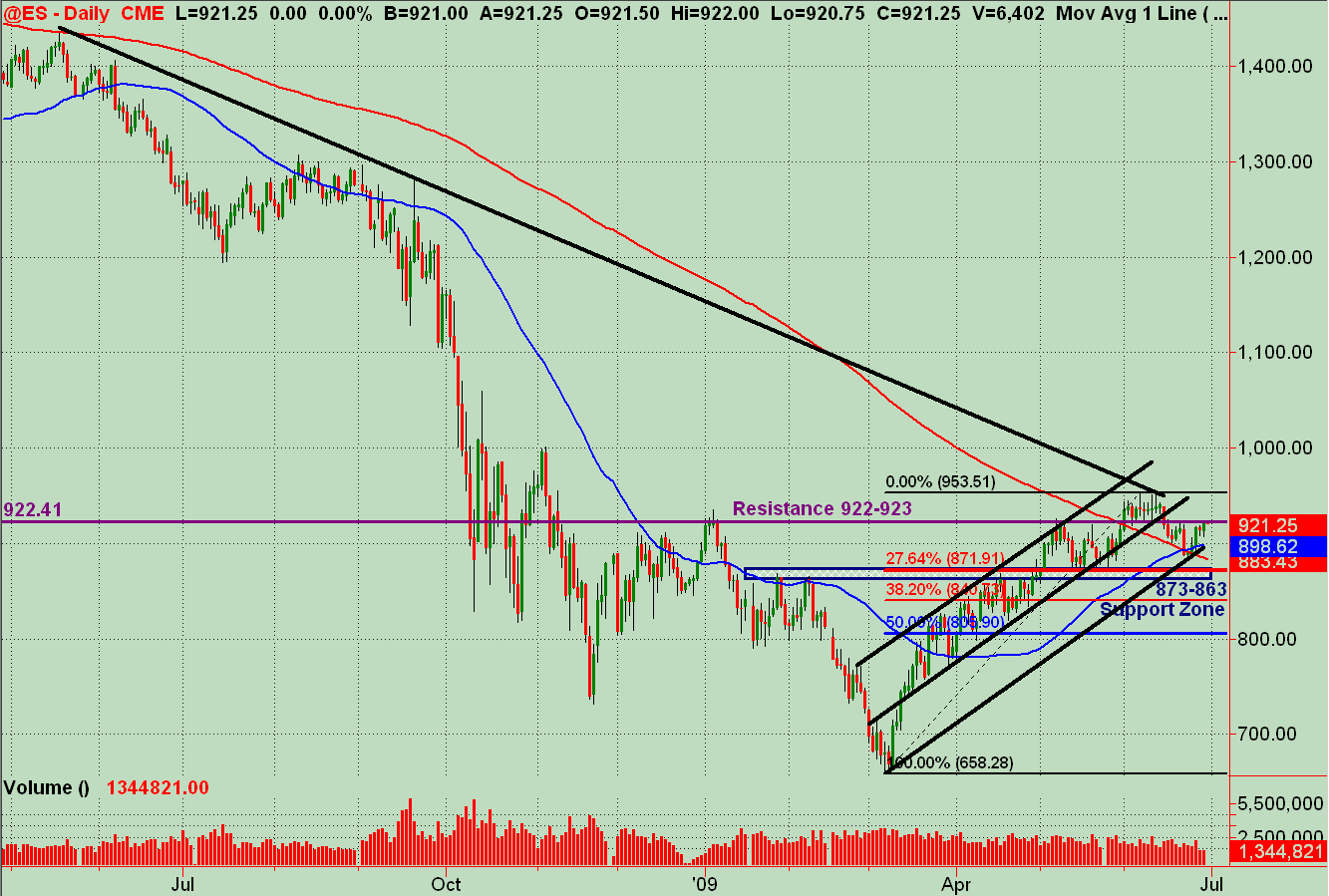
And the bigger picture of the ES on the Daily. Have a black down sloping trendline just above current price, and price is now above both the 50 and 200 SMAs. Some price action Resistance is drawn in along with an upward sloping trend channel (in black). More of a bigger map for now as we drill down into day and multi day potential ES trades (or NQ trades etc.). It's a hell of an interesting area at least. Upside strength seems like it could take it to 940-950. As for downside, I'd revert back to the lower daily trendline and the 13min chart price action S/R levels.
The ES closed today (Monday) right at a significant resistance area of 922-923 FWIW. And it seems that everybody's dog's brother's uncle's red headed step child's favorite doll's technical pattern is being talked about across tons of websites ... that we're in a likely right shoulder of an H&S. This reminds me of a post that Jim Kane made about the recent rising wedge that all were seeing. So, maybe it's real ... or maybe it'll be it's own undoing of itself with so many technicians trading out there now. Dunno! Just another observation.
Anyway, combine the posted chart level stuff with the daily and especially weekly Pivots ... plus your own strategery ... and it offers some good "potential" market mapping and TRADES!
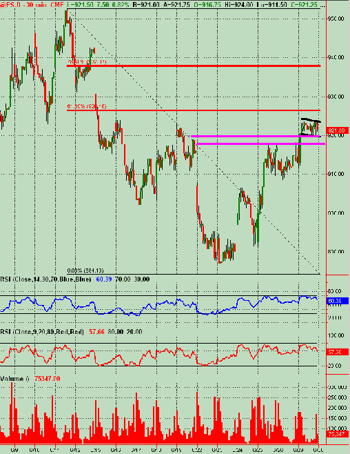
ES RTH 60min Chart ... offers a little different view. A Bull Flag shown by black lines with other S/R lines and fib retracements to take into account perhaps ... on this time frame. This helps flesh out more of what I'm looking at and hopefully adds to what might help anyone who peruses these chart/maps. Please feel free to offer feedback and other charts/analysis, as I've mentioned earlier!!!
Got Joe's RSI's on this one.
Got Joe's RSI's on this one.
Emini Day Trading /
Daily Notes /
Forecast /
Economic Events /
Search /
Terms and Conditions /
Disclaimer /
Books /
Online Books /
Site Map /
Contact /
Privacy Policy /
Links /
About /
Day Trading Forum /
Investment Calculators /
Pivot Point Calculator /
Market Profile Generator /
Fibonacci Calculator /
Mailing List /
Advertise Here /
Articles /
Financial Terms /
Brokers /
Software /
Holidays /
Stock Split Calendar /
Mortgage Calculator /
Donate
Copyright © 2004-2023, MyPivots. All rights reserved.
Copyright © 2004-2023, MyPivots. All rights reserved.


