Market Map
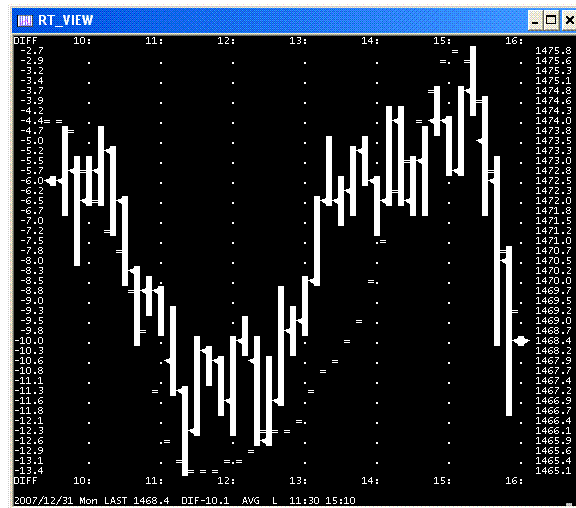
I used alt-printscrn to capture my daily intraday predicts+actual SP plot and then the windows accessory "paint" to paste the clipboard results and then saved my very first gif file a little while ago.
Below chart shows my own predictor program NAILED the intraday movement of SP index on monday 31 dec and goes a long way in confirming that price movement can be VALIDLY predicted using historical data (at least it was monday)..
dave in cocoa beach florida
Below chart shows my own predictor program NAILED the intraday movement of SP index on monday 31 dec and goes a long way in confirming that price movement can be VALIDLY predicted using historical data (at least it was monday)..
dave in cocoa beach florida
Dave, welcome to the forum. What does your predictor program say about Wednesday 2 January 2008?
Monday's predicts are unlikely to be matched by tomorrow's plot especially since there is a holiday preceding it.
Note that bottom line has the trade recommendation L or S and entry/exit times. Dave
Note that bottom line has the trade recommendation L or S and entry/exit times. Dave
Dave,
To get your images to show up in the forum wrap the image link with [img]*link goes here*[/img] tags. It would also be a good idea if you uploaded the images to the forum using the Upload link when posting a message. This way they'll always be attached to this topic in case you have to move them from the original location.
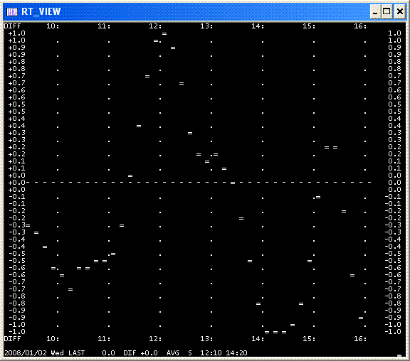
On the predictor image you have DIFF values of -1.0 to 1.0 on the left Y axis. What do these mean? On Monday's chart they represented the range of the S&P500 cash. You obviously don't expect tomorrow's range to be 2 points do you? The X axis is obviously the time of day ET.
re: what is left column DIFF
Its either the daily range of SP dif values (+- 1.0 when there is no data) OR its the +- xx.x predicted points. If I post again I will show what those look like for a predicted day, however its the relative hi/lo of the plot that determines the trade recommendation.. I'm kinda ashamed of my predicts vs actual SP diffs most days, but thats a minor matter if the predict hilo times produce a profit. Dave
Its either the daily range of SP dif values (+- 1.0 when there is no data) OR its the +- xx.x predicted points. If I post again I will show what those look like for a predicted day, however its the relative hi/lo of the plot that determines the trade recommendation.. I'm kinda ashamed of my predicts vs actual SP diffs most days, but thats a minor matter if the predict hilo times produce a profit. Dave
Daytrading - do you understand what davegemini is telling us?
Maybe its me but i don't have a clue.
Maybe its me but i don't have a clue.
Yes, I've seen this sort of thing before and I think then it was called a Market Map. It's basically a line chart that predicts the pattern that we will see in the market on the following day. I've never seen it work any better than a standard random distribution based on historic charts. In other words, I have never seen anybody be able to make money trading with it. However, the theory and application is interesting. If you can create a market map which is correct 70% of the time then you can make money with it. The maps that I've seen have only been right about 5% to 10% of the time. It will be interesting to see how Dave's charts do... The other maps usually have the full range of the market on the left hand side.
Thanks and I'll try to follow along
I've changed the title of this topic from "Test my first gif" to Market Map as I think it more accurately reflects what we're talking about.
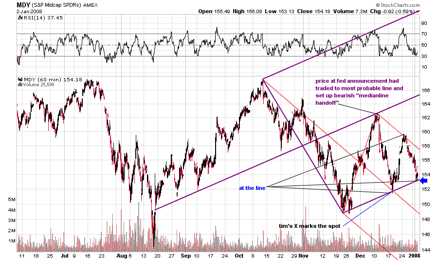
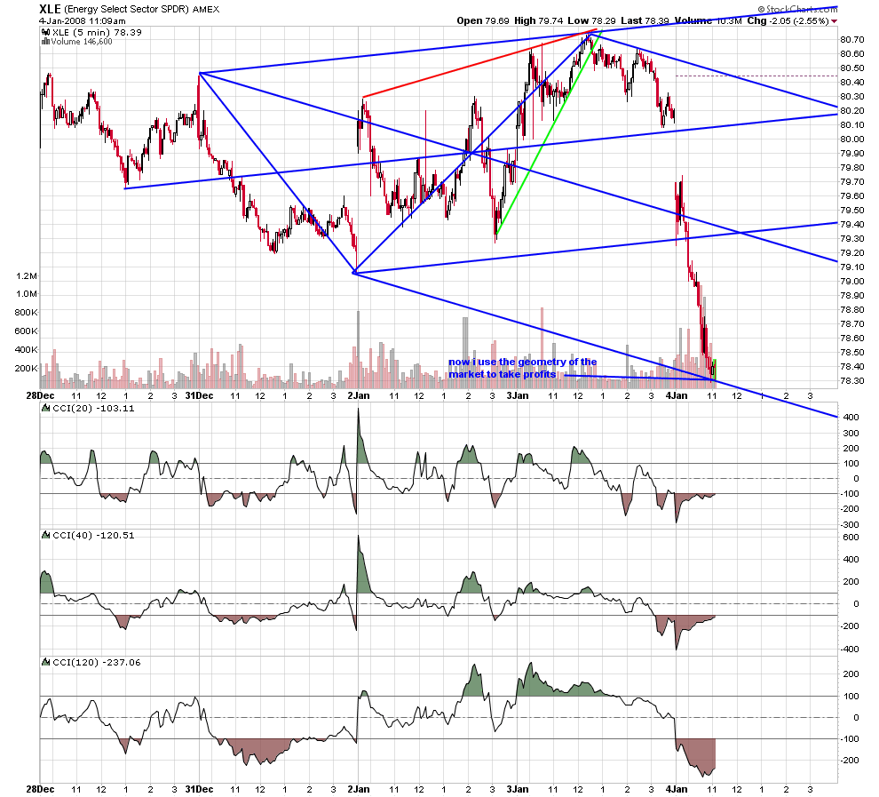
forgive me for changing the context... but the chicago trader tim morge's book is called ''mapping the markets''our motto at the kane forum is '' no forcasts... just what is...'' price at a line is taken seriously..price at a confluence of lines is taken very seriously and is well explained at tim's site www.medianline.com.
the purple set has been on the chart since late november and the red set was added the day before the fed announced.there is no holy grail; but i believe most traders would benefit from an awareness of the lines.
the purple set has been on the chart since late november and the red set was added the day before the fed announced.there is no holy grail; but i believe most traders would benefit from an awareness of the lines.
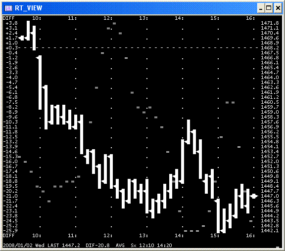
Jan02 Wednesday
The S "short" 12:10 -> 14:20 was a losing trade within a 20 point down day.
Jan03 Thursday
L "Long" 12:00 -> 15:00 (no chart posted to minimize #charts posted by me in this forum)
Here is the Jan02 chart using tags, (I tried to upload but nothing happened in my attempt)
The S "short" 12:10 -> 14:20 was a losing trade within a 20 point down day.
Jan03 Thursday
L "Long" 12:00 -> 15:00 (no chart posted to minimize #charts posted by me in this forum)
Here is the Jan02 chart using tags, (I tried to upload but nothing happened in my attempt)
Emini Day Trading /
Daily Notes /
Forecast /
Economic Events /
Search /
Terms and Conditions /
Disclaimer /
Books /
Online Books /
Site Map /
Contact /
Privacy Policy /
Links /
About /
Day Trading Forum /
Investment Calculators /
Pivot Point Calculator /
Market Profile Generator /
Fibonacci Calculator /
Mailing List /
Advertise Here /
Articles /
Financial Terms /
Brokers /
Software /
Holidays /
Stock Split Calendar /
Mortgage Calculator /
Donate
Copyright © 2004-2023, MyPivots. All rights reserved.
Copyright © 2004-2023, MyPivots. All rights reserved.
